Introduction
Minimalism in design is a philosophy of taking away what is not essential in order to focus on the core message. Therefore, minimalist logos deploy basic shapes, typography, and colors to outline a brand’s identity.
The fact that they can be used almost anywhere makes minimalist logos the choice of the majority of today’s brands. They create a long-lasting memory and are also easy to scale up and down. They are just as effective on digital and print platforms, thus making them a practical and trendy choice for businesses of all types.
1. What Makes a Minimalist Logo Effective?
An effective minimalist logo is a combination of simplicity and powerful visuals. Essential elements include:
a) Clean and Simple Design
-
No unnecessary elements or decorations
-
Concentrate on the most important shapes and typography
b) Versatility
-
It can be in black and white and color
-
It can fit different sizes and mediums without any issues
c) Memorability
-
It’s easy to identify and remember
-
The brand is still remembered despite the few elements used
d) Timelessness
-
It does not engage in short-lived fashion trends
-
It stays relevant for years or even decades
2. Benefits of Minimalist Logos
a) Enhanced Brand Recognition
Straightforward logos are the ones customers remember most. The result is better brand recall quality.
b) Professional Appearance
The minimalist design style epitomizes sophistication, modernity, and professionalism.
c) Scalability and Versatility
It appears perfectly on business cards, websites, merchandise, and mobile apps without losing clarity.
d) Easier Adaptation
It is easier to modify or refresh minimalist logos without sacrificing their identity.
3. Key Elements of Minimalist Logo Design
a) Typography
-
Employ clear, easy-to-read fonts
-
Stick to one or two font styles
-
Match the alignment with brand personality
b) Color Palette
-
Limit it to 1-3 colors
-
Go for contrast and simplicity
-
Use colors to evoke feelings
c) Shapes and Icons
-
Use simple geometric shapes
-
Keep away from intricate details or excessive embellishments
-
Icons should serve the brand, not dominate it.
d) Negative Space
-
The intelligent exploitation of negative space can enhance depth and creativity
-
Maintaining simplicity while enhancing uniqueness
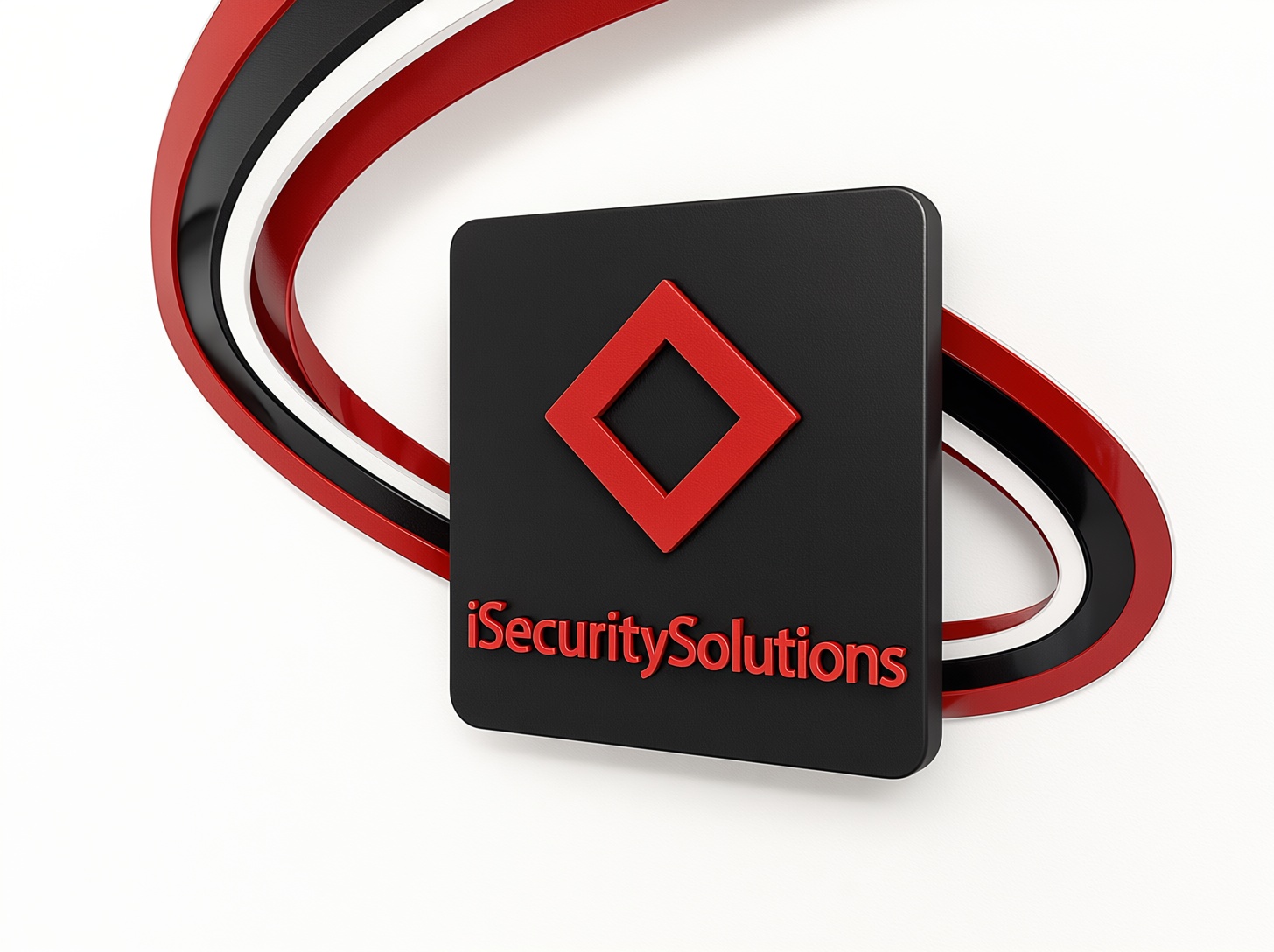
4. Examples of Successful Minimalist Logos
-
Apple: The apple silhouette directly represents simplicity and innovation.
-
Nike: The swoosh is clean, dynamic, and instantly recognizable.
-
Adidas: The three stripes are minimal yet powerful, representing performance and motion.
-
Google: Clean wordmark with subtle color variation conveys accessibility and simplicity.
These logos demonstrate that minimalism doesn’t equal a lack of creativity—on the contrary, it involves condensation of the core brand idea into a concise and powerful sign.
5. Tips for Designing a Minimalist Logo
-
Focus on the Brand Core: Highlight the essence of your brand without extra elements.
-
Limit Colors: Stick to a simple color palette for consistency and impact.
-
Prioritize Readability: Ensure any text is easy to read at all sizes.
-
Test Across Mediums: Check how the logo appears digitally, in print, and on merchandise.
-
Embrace Negative Space: Use it creatively to make the logo more memorable.
-
Avoid Trends: Stick to timeless design principles to ensure longevity.
Conclusion
Minimalist logos show that what’s simple can create a powerful impact. A brand can design a logo that is adaptable, memorable, and even timeless by taking away the unnecessary details and concentrating on its essence.
A well-thought-out minimalist logo will not only help people recognize the brand easily but it will also express professionalism and clarity where everything is hidden in complex visual imagery. For companies that want to have an enduring impact on visual presentation, minimalism is not simply a passing trend but actually a kind of approach.
FAQs
Q1: Why are minimalist logos so popular?
A: They are versatile, timeless, memorable, and convey professionalism with simplicity.
Q2: Can a minimalist logo work for any industry?
A: Yes. Minimalism can be adapted to any industry by focusing on brand essence and core values.
Q3: How many colors should a minimalist logo have?
A: Typically 1-3 colors to maintain simplicity and clarity.
Q4: Should text be used in a minimalist logo?
A: Yes, if it enhances brand recognition, but it should be clear, readable, and minimal.
Q5: How do I make a minimalist logo memorable?
A: Use strong shapes, clever negative space, and typography that reflects your brand personality.