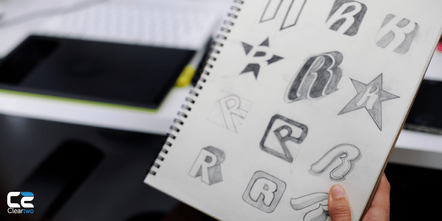
Finding your font
Typography (the art of printed text) is an essential aspect of designing your logo. The font in your logo is responsible for communicating the name of your company and its personality. While many larger companies present their logo without text (think Nike’s ‘tick’ and McDonalds’ ‘golden arches’), it is vital to communicate the name of your company first and foremost.
There are three main types of font to choose from, and each have their own strengths and weaknesses.

Serif fonts (with lines attached to the end of a stroke in a letter or symbol) are considered classic and reputable, if sometimes old-fashioned. If you’re aiming for a professional and traditional vibe for your company, a serif font is ideal. However, serif fonts can appear outdated as more companies adopt sans-serif fonts for publications, etc. Here is just one example of a serif font logo

Sans serif fonts are commonplace amongst online businesses, and many studies show they are easier to read from a screen, though serif fonts are still perfectly functional. With fewer flourishes, sans serif fonts are clean, modern and easy to read (even in small type). If you want a clean-cut and contemporary logo, sans serifs are the way to go! However, sans serif fonts are extremely common, and make it difficult to set your business apart from the competition. Here’s one example of sans serif font in a logo

Script fonts (think elaborate hand-writing) have a lot of potential, but need to be used carefully, as they can be much harder to read than serif or sans serif fonts. This type of font is excellent for a creative, elegant or informal logo, and can evoke a strong style or theme if used well. Take the logo below for an example – the colour scheme and star shape allude to the Americana style popularly adopted from 1950s American diners


